Special Olympics of Texas Accessibility Audit and Redesign
The Special Olympics of Texas website is inaccessible, inconsistent, and redundant. As a result, users are experiencing feelings of alienation, confusion, and frustration when navigating the website and when attempting to register as an athlete or volunteer.
The Problem
The Special Olympics of Texas website was created to digitally expand their reach and improve participation throughout local communities. However, the current website design is not compliant with accessibility guidelines; alienating potential athletes, volunteers, and stakeholders and creating an identity misalignment for the brand. The website also hosts many inconsistencies as well as superfluous information, buttons, and links; creating frustration and confusion for users.
The Solution
Organizing and simplifying the website design decreases the likelihood of users feeling confused or frustrated. Integrating accessibility into the design allows for more people to interact with the organization’s website.
The Impact
After redesigning the Special Olympics of Texas website, users reported less negative feelings when interacting with the organization's website, leading to volunteer registration success increases from 0% to 88.9%. Addressing accessibility issues ensures no potential athletes or volunteers will be alienated from the lack thereof.
The Team
Erin Yurk
Catherine Champion
Cambria De La Cruz
Shruthi Nagaraja
James Flores
Hayley Brown
My Key Roles
Project Manager
Ideation Lead
Style Guide
Tablet Design
Where We Started
We began by studying the original website and conducted an accessibility audit. This informed us that the Special Olympics of TX website, known for helping intellectually disabled people, has many accessibility compliance issues.
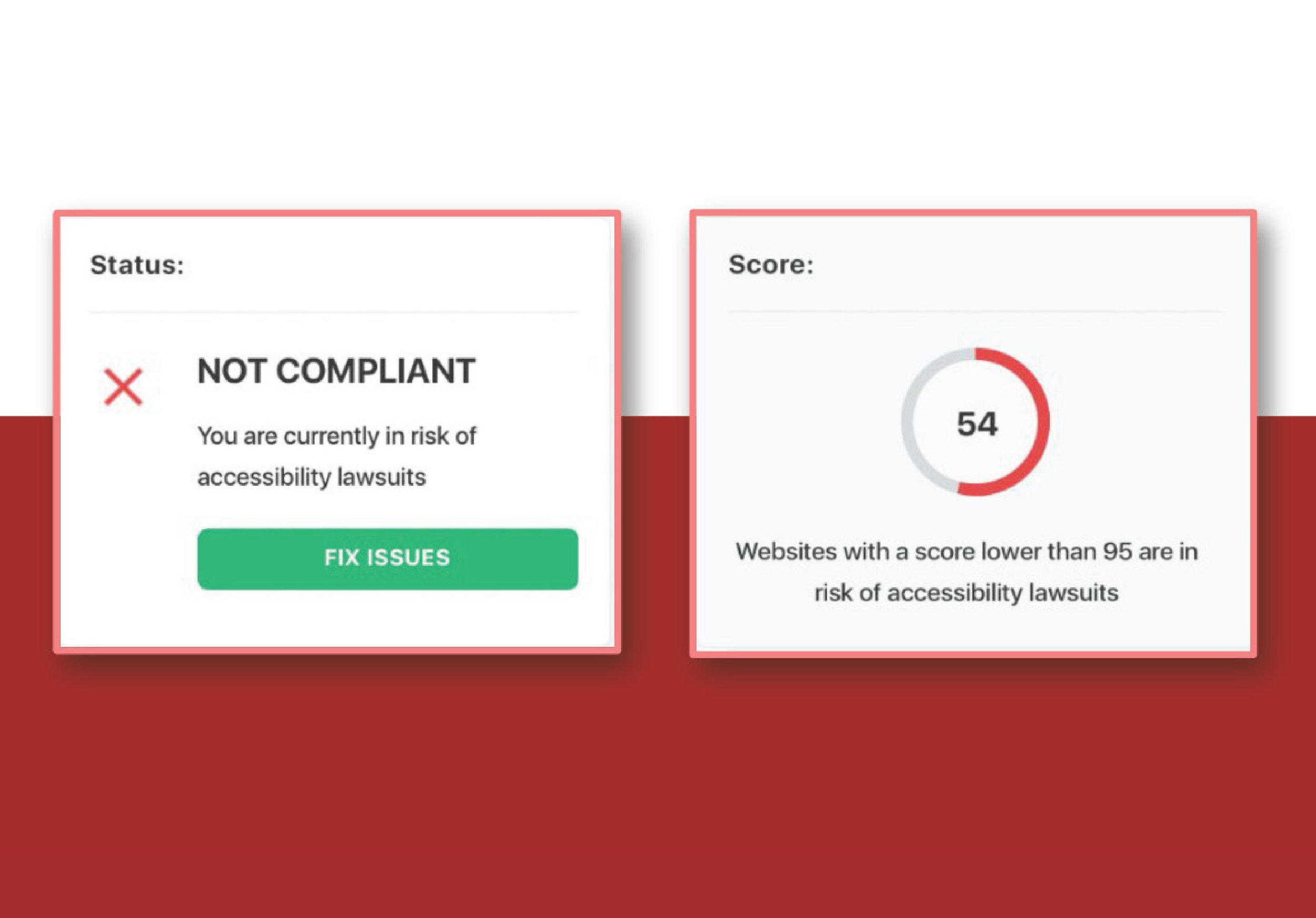
The website received a score of 54 out of 100, with anything under a score of 95 being at risk of a lawsuit.
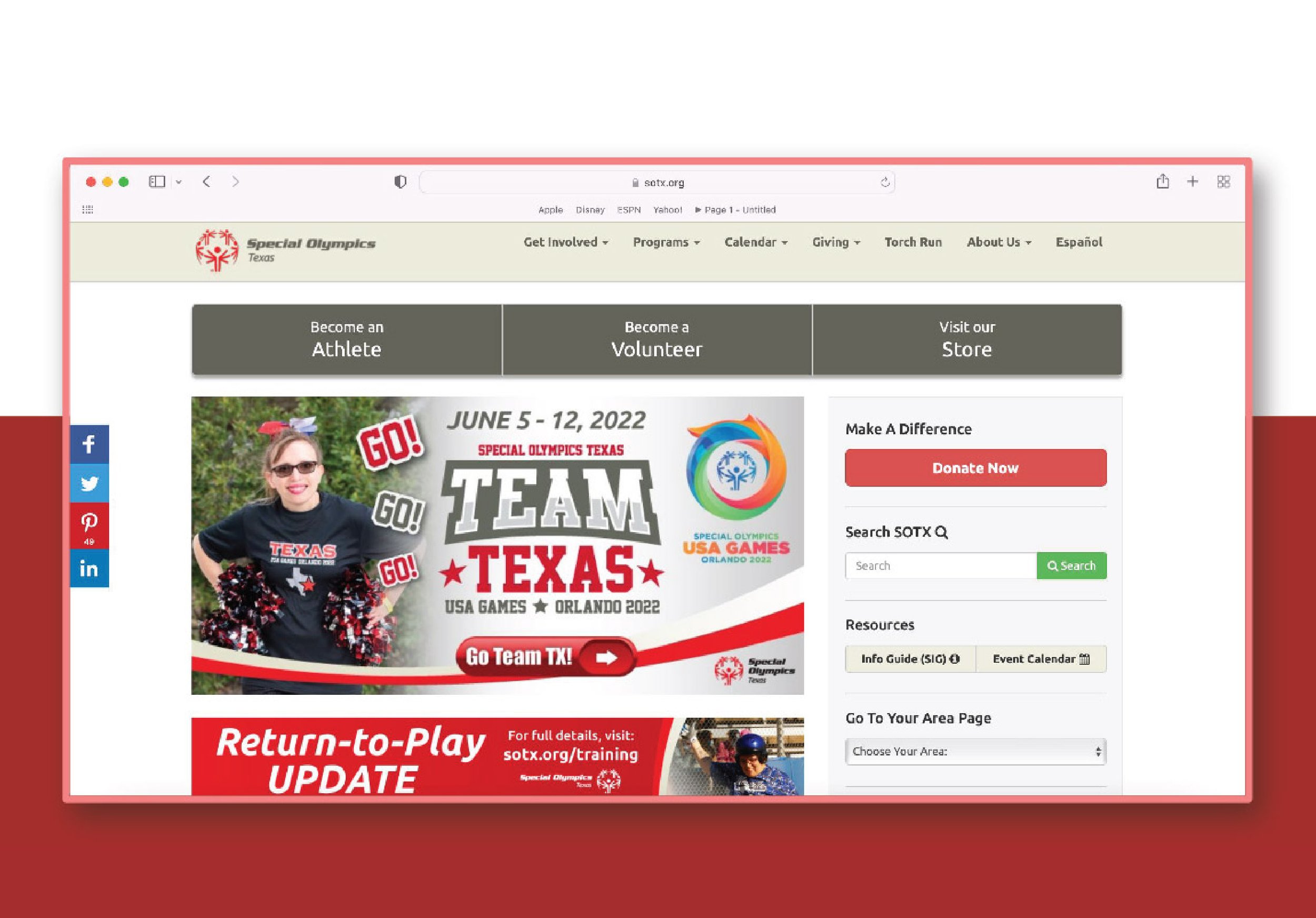
The original Special Olympics of Texas website design
Accessibility audit report
Design Failures
The audit revealed some key takeaways of design failures on the homepage.
Out of 8 instances, 8 font sizes failed to be large enough to qualify as readable.
Out of 162 instances of variation between foreground and background colors, 30 colors failed to provide enough contrast.
Finally, out of 3 separate forms on the homepage, only 2 had submission buttons.
Assistive Technology Failures
The website also failed to be fully accessible to assistive technology users, including highlights such as:
Only 8.3% of menus & dropdowns are tagged
14.3% of objects & images are described
20% of form fields are properly labelled
41.7% of links to new tabs/windows are described
60% of buttons are tagged and described
66.7% of page landmarks are tagged
Competitor Analysis
When evaluating our competitors we noted a few differences that made their websites easy for people of varying abilities to use, such as:
Large text, icons, and buttons
Well organized navigation and simple layout
High contrast between background/imagery and text
Hover elements to tell users where they are
We also learned from their weaknesses made notes to avoid their mistakes.
Too much variation in text size creates confusing hierarchy
Difficult-to-read display font
4 rows of buttons and navigation menus in the header alone
Lacking contrast between background videos and overlaid text
Disabled Athlete Sports Association, Move United, Scope, and Morgan’s Wonderland
Strategic Goals
The Special Olympics strategic plan gave insight into their goals and how a website design could help. The two goals outlined in the plan are:
To improve local sports participation and
To remove barriers to inclusion and expand their reach through the use of technology.
We believe that improving accessibility will allow for greater diversity of participants by creating a more inclusive digital environment and also addressing the registration flow would lead to an increase in participation.
So we set out to discover how we might make the digital experience of the website and registration more accessible, inclusive, and easier to navigate.
Meet Josh. We believe Josh to be the expected demographic of individuals wanting to volunteer. He is currently looking to fulfill community service hours and is looking for fun ways to get involved in his community.
User Interviews
With Josh in mind, we set out to interview users with two main goals in mind.
What are the website users’ main goals?
What obstacles stand in the way of these goals?
During this process we discovered insights that helped us focus our path moving forward. Users wanted:
Greater emphasis on the event calendar
To know the mission of the organization early in their navigating
Simpler, easier to digest pages
Our results also indicated that 80% of users had an issue with navigation.
“Overwhelmed” was the feeling most users described during the volunteer registration. Many claimed the site consisted of too many pages and buttons.
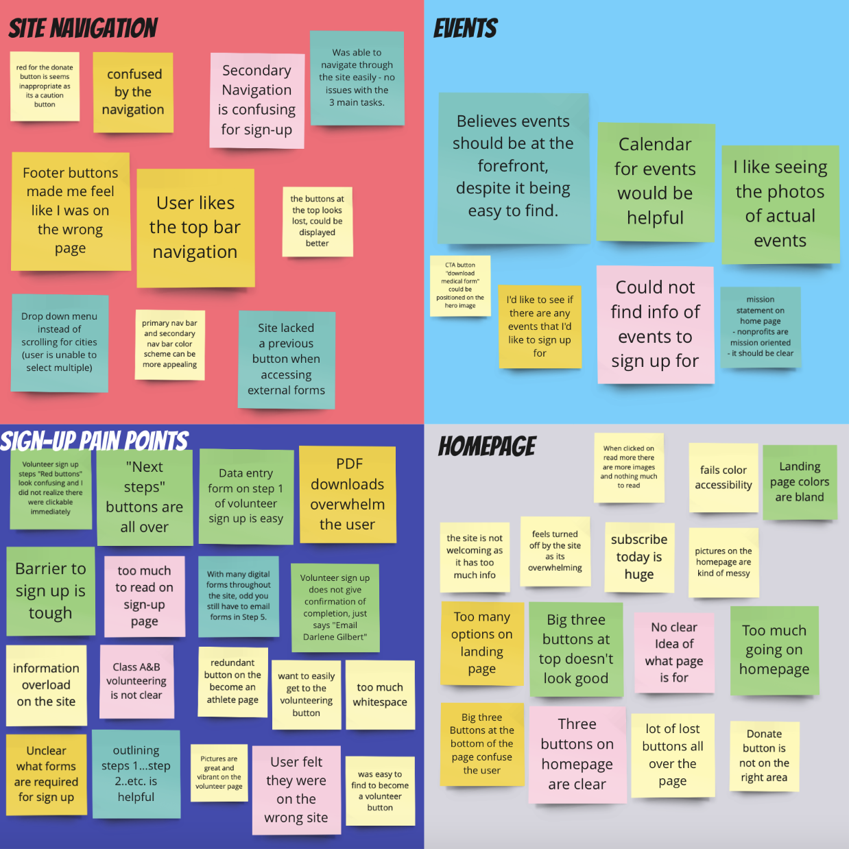
User interview insights matrix
Empathizing with Our User
Based on our research findings, we turned our photo persona into a more fleshed out user persona. Josh has a sister with an intellectual disorder so he wants to get involved in the community and make connections. He needs a flexible volunteering schedule and gets frustrated when simple things are made complicated. He doesn’t have much time to shift through a disorganized calendar to find events to volunteer for.
After this, we tried to understand what Josh might be feeling as he navigates the Special Olympics of Texas website. We accomplished this by creating a User Scenario, User Journey, and a Storyboard. Each iteration of his path helped us to better understand what could improve the website.
The main opportunities we found were:
Create a volunteer dashboard where users can track their hours and events
Put direct links to volunteer forms on social media
Make volunteering a visual priority to make it faster and easier for people to sign up
Break up the volunteer form in to smaller steps and show progress throughout
Have a shorter form to get more information about volunteer opportunities
User Persona
User Journey
User Scenario
Storyboard
Information Architecture
During an assessment of the information architecture we noted there were too many options on the primary navigation bar for people to sort through. Using card sorting we narrowed it down to 5 main options and also simplified the secondary navigation options.
The original navigation
After 1 Round of Card Sorting
After 2 Rounds of Card Sorting
User Flow
On the current website, volunteers choose to sign up for Class A or Class B whether they want to become a volunteer coach or a “day-of” volunteer. Based on user feedback we consolidated the two separate registrations so that everyone registers as a “day-of” volunteer then those who wish to become a more involved volunteer, such as a coach, may select to proceed with the rest of the registration. This reduces confusion and also creates a shorter registration process for those who want less volunteer responsibilities.
Volunteer Sign Up User Flow
Style Guide
Our style guide focuses on using higher contrast colors to increase accessibility across the site. We chose red as a nod to the brand colors for the national organization, but darkened it to suit the diverse needs of our users.
Style guide sample page
Wireframes
After defining how people would use the site and mapping their path we moved on to creating wireframes, beginning with sketches and turning those into digital wireframes. This allowed us to quickly visualize where content would sit on each page and how to prioritize the key insights from our research.
Sample Wireframe Sketch
Sample Digital Wireframe
Mid-fidelity Prototype and Testing
With our wireframes and style guide on hand we were able combine them into mid-fidelity prototype design to begin testing. This revealed several issues that needed to be addressed.
Class “A” and “B” titles for volunteers confuse the user
No ability to go to a previous step in registration
Saying “success” before being finished with registration is confusing
Mission statement is too long, hard to read, and wasn’t clear it was the mission statement
Testing feedback prioritization matrix
High-fidelity Prototypes
High-fidelity desktop homepage
High-fidelity tablet registration page
Testing in High-fidelity
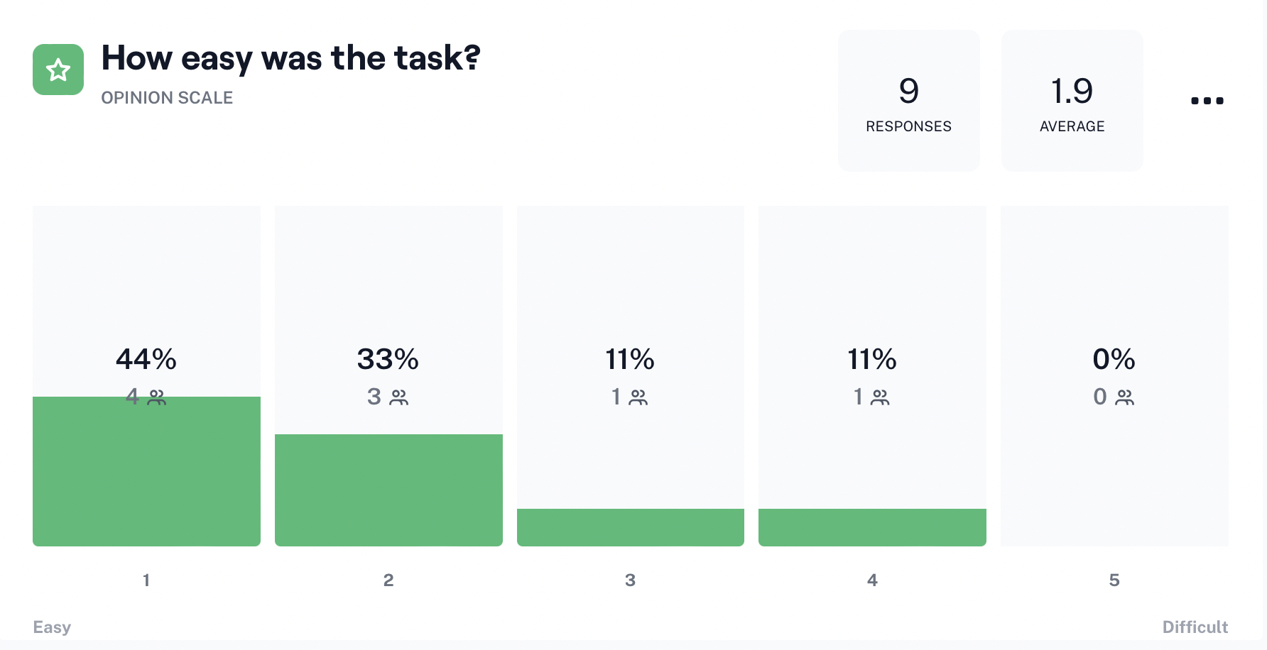
High-fidelity tests were conducted using Maze. This gave us data in real time and helped us visualize the paths our users were taking. Below is a sample of user feedback on how easy it is to sign up to become a volunteer.
The average ease of signing up to become a volunteer was 1.9 out of 5
Find events to volunteer for was rated as 1.4 out of 5
Finding the organizations mission was rated as 2.1 out of 5
Volunteer registration ease of use feedback
Task Completion Rates
Not only were we encouraged by the ease of use reported in our testing, but we found huge increases in task completion.
85.7% of users were successful in finding events to volunteer for
71.4% of users were able to find the mission statement
We saw an 88.9% success rate when registering as a volunteer, up from 0% when testing the original site.
This success with signing up to volunteer means an increase in the number of volunteers available for Special Olympics events.
Besides the functionality issues, we received two critiques on the website; “Join” is not the best word to lead volunteers to the registration and when volunteers are looking for opportunities, they don’t always think of visiting the calendar of events.
We received no negative feedback on the navigation or the design of the volunteer registration compared to 80% of users complaining of issues on the current site.
Maze testing heat map
Final Iteration
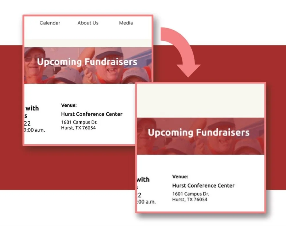
When designing our final iteration, it was important to take into account our testing feedback, but even more important to make it accessible to all users.
While our colors met AA criteria, our main red background color paired with our main white font color failed AAA criteria. We decided to use the suggested shade of red to increase our contrast ratio to be AAA compliant so no users are affected.
We then double checked all of our images to ensure that overlaid words had sufficient contrast as well. We increased the opacity of the red over the images to remain AAA compliant.
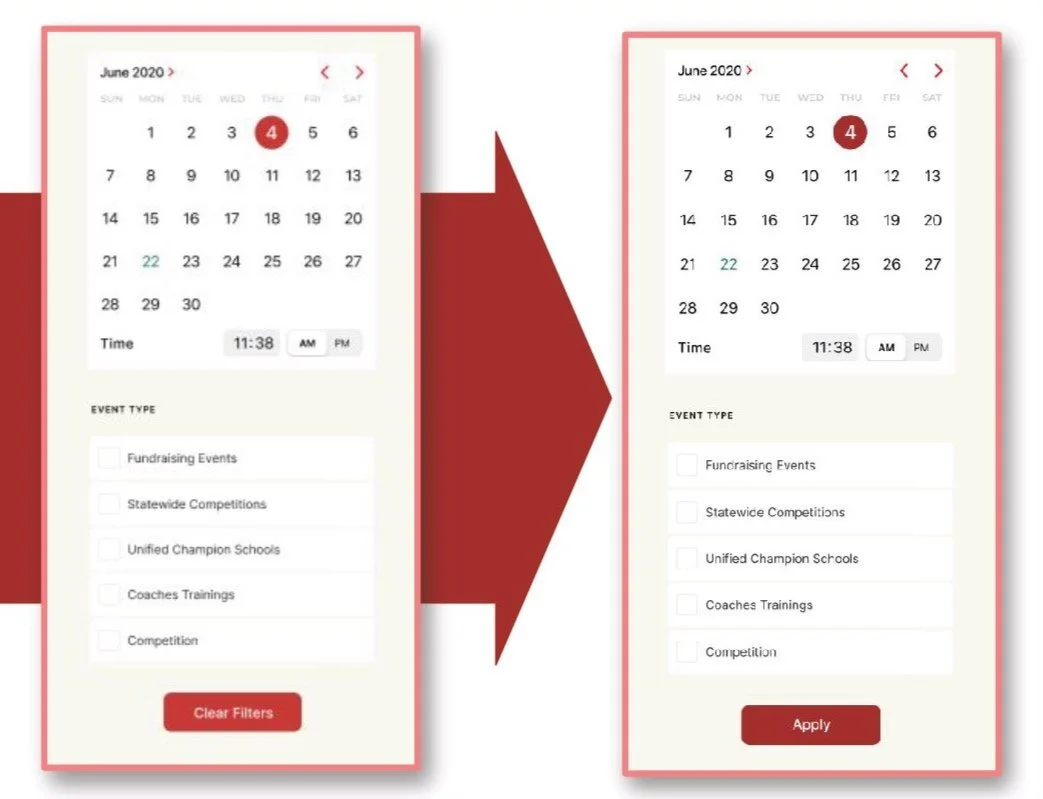
Our first iteration of the high-fidelity prototype was designed to produce the filtered events automatically as the boxes are checked, however, one of the design failures on the accessibility report was that every form should have an associated button so we scrapped the “clear filters” button and added an “Apply” button so that there’s no application of the filters until a submission has been made by the user.
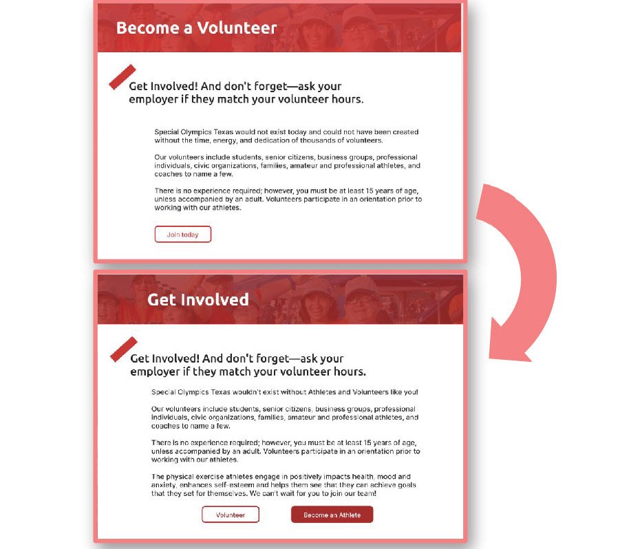
From the homepage, our initial design had two buttons labelled “join” which took the user to the Volunteer Landing Page. Because our testers pointed out that the word “join” doesn’t necessarily mean “volunteer”, we created a Get Involved Landing Page that the join button will lead to instead.
Future Opportunities
To continue to improve the functionality and accessibility of the Special Olympics of Texas website, we outlined the next challenges we’d like to design. We believe these will benefit users, expand outreach and also increase participation.
Account creation for continuing registration at a later time
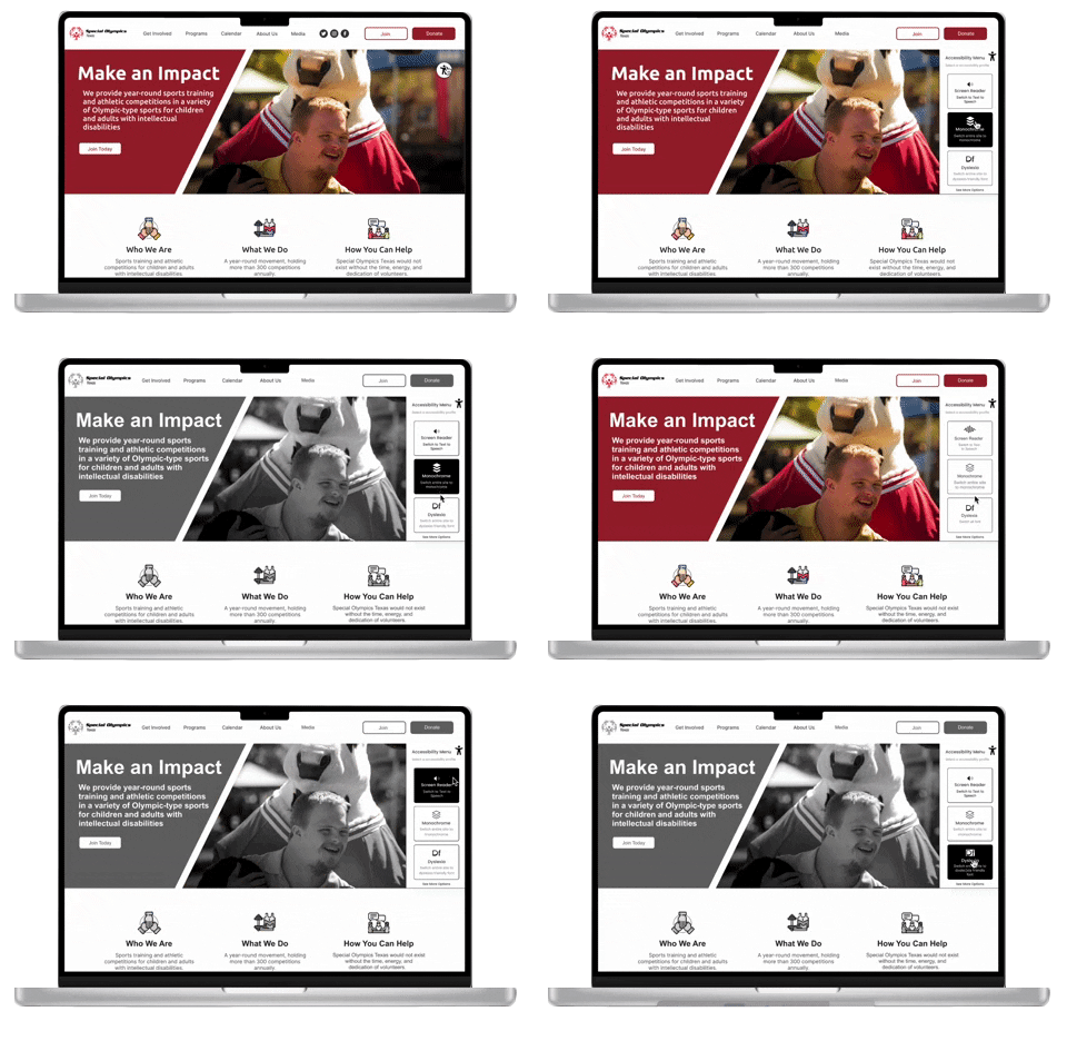
Expand accessibility tool options
Add the option for recurring donations

